

Let's Build - A Notification System in Nuxtjs
In this project you will learn Nuxtjs, Vuex, and other web technologies. let's build a Nuxtjs notification system together.


Good day everyone 👋. Welcome back to my blog.
I'm back with another Let's Build entry. Today we will be using Nuxtjs to implement the following post - click here to see. In that entry, we built a custom modal using just HTML and CSS. Today, we will be using Nuxtjs to add a bit of functionality to the project. This is to build your familiarity with Nuxt. Please be aware that this project will be a little more advanced than my usual entries, but I will try to break it down as much as possible. Today, we will utilize auto-imports, Vuex and other Nuxt technologies to build the project shown below.
If you would like to fork the project, I have it on GitLab here.
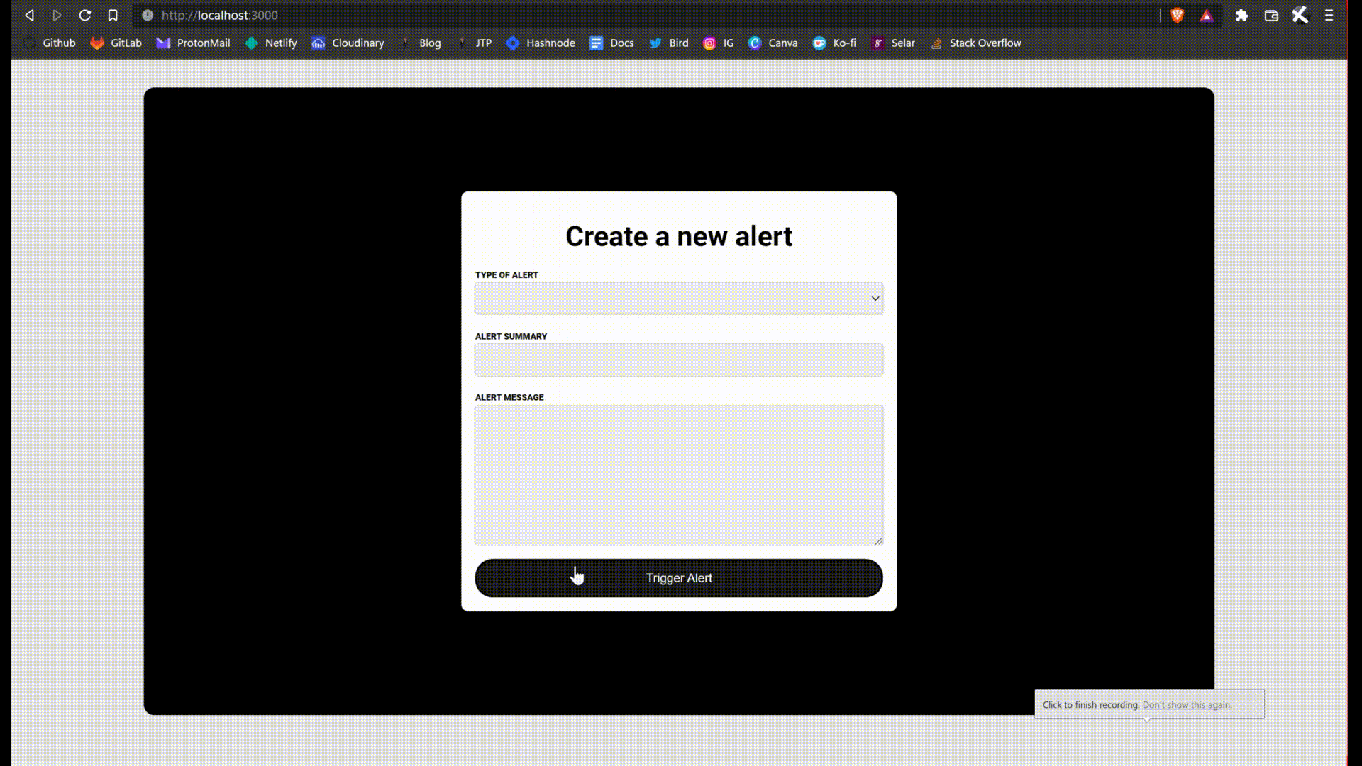
Below is a demonstration of how the project works,
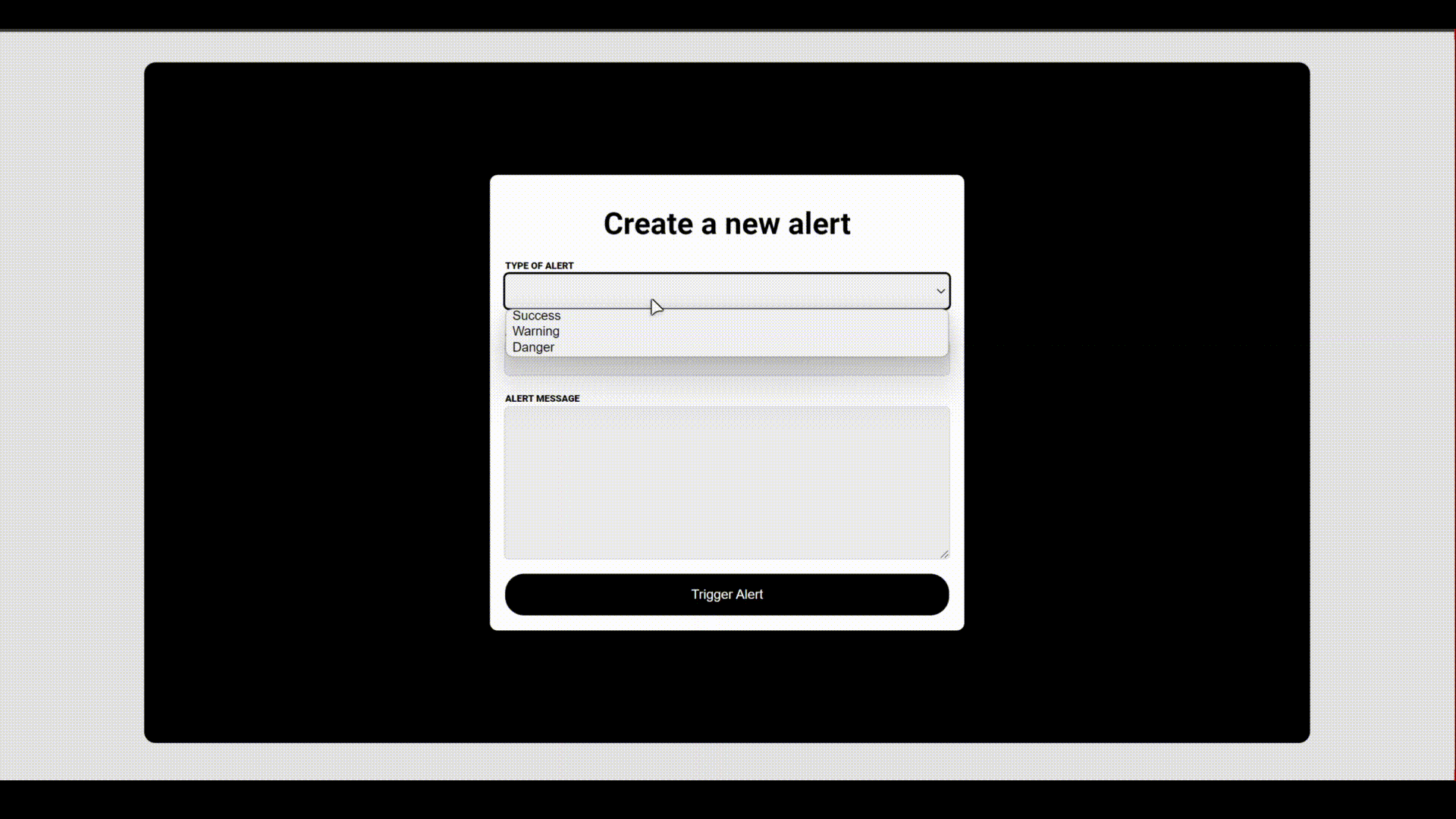
You can also find a physical demonstration that will allow you to test it out yourself here
Config
In this section, we will prepare the basic html/css and set up the project requirements.
First of all install nuxt in an empty project directory. The command is npx create-nuxt-app .
In your static directory, create a new file called app.css. Now in your nuxt.config.js, link to the file by editing the css array. Like so,
css: [
    '@/static/app.css'
],
In the app.css directory add the following css code,
@import url('https://fonts.googleapis.com/css2?family=Roboto:wght@300;400;500;700;900&display=swap');

* {
  margin: 0;
  padding: 0;
  box-sizing: border-box;
}

html {
  font-family: 'Roboto', Verdana, Georgia, 'Times New Roman', Times, serif;
}

body {
  width: 100%;
  background-color: #E4E3E3;
}
We are simply resetting the document default styles and importing the Roboto font.
Next, clean up the components directory by deleting all the default files. Create two new components - Alert.vue and Form.vue. In the index page, remove the default imports and import the Form component. Your index page should look like this :
<template>
  <div class="container">
    <Form />
  </div>
</template>

<script>
export default {

}
</script>

<style scoped>
.container {
  width: 80%;
  height: 720px;
  padding: 1rem;
  margin: 2rem auto;
  background: #000;
  border-radius: 12px;
  display: flex;
}
</style>
We are auto-importing only the form component. Please take note of the container clas and style.
In your Alert.vue, paste the following code
<template>
  <div class="alert d">
    <div class="head">
      <h2>An error occurred</h2>
    </div>
    <div class="body">
      <p>Lorem ipsum, dolor sit amet consectetur adipisicing elit. Repellendus temporibus consectetur quas quia vitae cupiditate vel quaerat nemo magnam laborum nam praesentium suscipit assumenda, aspernatur voluptatum soluta minus totam optio explicabo asperiores ut. Iste, saepe obcaecati cupiditate sit perspiciatis laboriosam?</p>
    </div>
    <div class="footer">
      <button>Close</button>
    </div>
  </div>
</template>

<script>
export default {

}
</script>

<style scoped>
.alert {
  display: flex;
  flex-direction: column;
  margin: auto;
  background-color: #fff;
  width: 500px;
  height: 300px;
  border-radius: 8px;
}

.alert .head {
  height: 50px;
  padding: 1rem;
  border-bottom: 1px solid #000;
  display: flex;
  justify-content: center;
  align-items: center;
  text-align: center;
}


.alert .body {
  height: 200px;
  padding: 1rem;
  display: flex;
  justify-content: center;
  align-items: center;
  text-align: center;
}

.alert .footer {
  height: 50px;
  border-top: 1px solid #000;
  padding: 1rem;

  display: inline-flex;
  align-items: center;
  justify-content: flex-end;
}

.alert .footer button {
  height: 30px;
  padding: 0.4rem 0.6rem;
  color: #fff;
  border-radius: 4px;
  cursor: pointer;
  border: none;
}

.alert.s .footer button {
  background: green;
}

.alert.w .footer button {
  background: rgb(184, 184, 44);
}

.alert.d .footer button {
  background: red;
}

@media screen and (max-width: 728px){
  .alert {
    width: auto;
    height: auto;
  }
}

@media screen and (max-width: 456px){
  .alert .head h2 {
    font-size: 16px;
    font-weight: 600;
  }

  .alert .body{
    font-size: 14px;
  }
}
</style>
We are taking the html and css directly from the contact-form post here.
Now in your Form.vue copy and paste the following :
<template>
  <form>
    <h1>Create a new alert</h1>
    <div class="form-group">
      <label>Type of alert</label>
      <select class="form-control" v-model="alert.type">
        <option value="s">Success</option>
        <option value="w">Warning</option>
        <option value="d">Danger</option>
      </select>
    </div>
    <div class="form-group">
      <label>Alert Summary</label>
      <input type="text" class="form-control" v-model="alert.summary">
    </div>
    <div class="form-group">
      <label>Alert Message</label>
      <textarea type="text" class="form-control lg" v-model="alert.message"></textarea>
    </div>
    <button type="submit">Trigger Alert</button>
  </form>
</template>

<script>
export default {
  data() {
    return {
      alert: {
        type: '',
        summary: '',
        message: ''
      }
    }
  }
}
</script>

<style scoped>
form {
  display: flex;
  flex-direction: column;
  margin: auto;
  width: 500px;
  background-color: #fff;
  border-radius: 8px;
  padding: 1rem;
}

form h1 {
  text-align: center;
  padding: 1rem;
}

form  .form-group  label {
  text-transform: uppercase;
  font-weight: 900;
  font-size: 10px;
  padding: 0.2rem  0  0.2rem  0;
}
form .form-group {
  display: flex;
  flex-direction: column;
}

form .form-group .form-control {
  height: 36px;
  background: #ECECEC;
  color: #000;
  border: none;
  outline: 1px solid #D9D9D9;
  border-radius: 4px;
  padding:  0 0 0 0.2rem;
  margin-bottom: 1rem;
  transition: background .2s linear;
}

form .form-group .form-control.lg {
  height: 10rem;
  padding: 0.2rem;
}

form .form-group .form-control:focus {
  outline: 2px solid #000;
  background: #FFF;
}

form button {
  width: 100%;
  padding: 12px;
  color: #fff;
  font-weight: 500;
  font-size: 14px;
  cursor: pointer;
  background-color: #000;
  border-radius: 20px;
}

form button:hover {
  background-image: linear-gradient(rgba(66,66,66,0.4) 0 0);
}

@media screen and (max-width: 728px){
  form {
    width: auto;
    height: auto;
  }
}
</style>
I have taken the liberty of connecting the input elements to the alert object. They are bonded using Vue's two way binding. Copy the code from here or from the my GitLab.
That's all for configurations.
Getting started with Vuex
Firstly, initiate Vuex by deleting the readme.md file and creating a new index.js file.
In this new file paste the following code,
export const state = () => ({
  alert: {
    isShowing: false,
    type: '',
    summary: '',
    message: ''
  }
})

export const mutations = {
  TRIGGER_ALERT(state, payload) {
    state.alert.isShowing = true
    state.alert.type = payload.type
    state.alert.summary = payload.summary
    state.alert.message = payload.message
  }
}

export const actions = {
  triggerAlert({commit}, alert) {
    commit("TRIGGER_ALERT", alert)
  }
}

export const getters = {

}
We are creating the alert state. Notice that it is a perfect mirror of the alert object in the Form component. This is intentional.
Next we create the mutation, the mutation mutates the state. In Vuex, it is best practice to only change the value of states using mutations. It is also best practice to define mutations in uppercase.
Our TRIGGER_ALERT mutation receives a payload and then assigns the values inside the payload to the state.
Lastly we have the action. Actions dispatch mutations. It is best practice to only call mutations through actions. Actions are defined using camelCase.
Our triggerAlert function, accepts the alert payload and commits the mutation with the payload.
Calling the triggerAlert action
Back in our form component, we create a new method called trigger. Your script section should have this,
methods: {
    trigger() {
      this.$store.dispatch("triggerAlert", this.alert)
    }
}
This should be under the data function and separated by a comma.
Our trigger method dispatches the action we created in our Vuex store. Notice that it passes the alert object as a parameter, and that the action receives this object and uses it to commit a mutation which assigns the value of the object to the state.
To call this trigger method, change the form element to look like this
<form @submit.prevent="trigger">
This tells Vue to prevent the default submit behavior and instead call our function on form submit.
Conditionally rendering the Form & Alert components
We want the Form component to disappear and the Alert component to appear when the user clicks the trigger alert button.
To achieve this, we need to be able to read the alert.isShowing state to check if the alert should be showing. We could read it directly, but I want to introduce you to the recommended alternative, GETTERS.
In Vuex, getters return the value of states. They are the recommended way to get the values of states.
Replace the getters section of your Vuex store with the following,
export const getters = {
  isAlertShowing(state) {
    return state.alert.isShowing
  }
}
Now we have access to the alert.isShowing state. We can access that using the following $store.getters.isAlertShowing. If we were in a function or something, we would add this. to the front of the command, like so this.$store.getters.isAlertShowing.
Now let's tell the browser to only show the form if the alert is not showing.
<Alert v-if="$store.getters.isAlertShowing" />
<Form v-else />
Notice that we are now auto-importing the Alert component. Give it a try, click on the trigger alert button. You can reset the page to reset the state. This is what I'm talking about.
We are almost done.
Retrieve and parse the value of the alert object.
We need to create another getter. This one will return the entire alert state. We will use this to update the values of the alert component. This will make the component dynamic or user-generated.
In your getters, under the isAlertshowing function, create a new function called returnAlert. Like so,
returnAlert(state) {
  return state.alert
}
Now in the Alert component, receive and parse the values of the alert object gotten from the getter. Your Alert components template should now look like this,
<div class="alert" :class="$store.getters.returnAlert.type">
    <div class="head">
      <h2>{{$store.getters.returnAlert.summary}}</h2>
    </div>
    <div class="body">
      <p>{{$store.getters.returnAlert.message}}</p>
    </div>
    <div class="footer">
      <button>Close</button>
    </div>
</div>
This should make the alert data correspond to the data you typed in.
Add close functionality
Essentially, we want the form to return back to its original state when the user clicks close.
Create a new mutation called CLOSE_ALERT. Like so
CLOSE_ALERT(state) {
    state.alert.isShowing = false
}
Now create a new action to commit the mutation called closeAlert.
closeAlert({commit}) {
    commit("CLOSE_ALERT")
}
Next in your Alert component, create a new method called close.
methods: {
    close() {
      this.$store.dispatch("closeAlert")
    }
}
Now call this method once the button is clicked.
<button @click="close">Close</button>
Conclusion
That's it, you have done it. Over the coming days, I will be adding some animations to it but as for functionality, this is all there is to it. Hope you enjoyed. If you didn't please let me know why in the comments. Thanks for reading and thanks for the views.